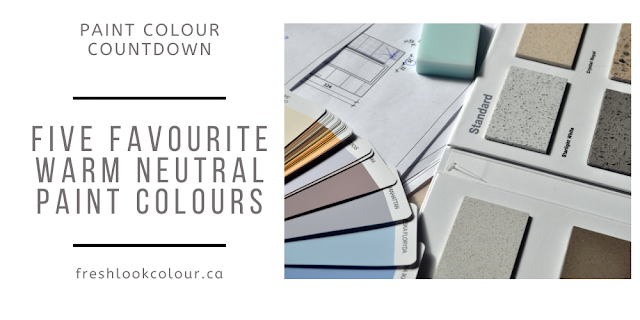
My 4 Favourite Warm Grays by Sherwin Williams

Hi Everyone
Thanks for checking out my blog. Today I wanted to share with you 4 of my favourite warm gray paint colours. These paint colours are all Sherwin Williams as those are the colours I generally work with on my consultations.
Now I know what you are thinking - there is no such thing as a warm gray 😏. And don't get me wrong - a warm gray is still going to be gray, which is technically a cooler colour. In this blog when I'm referring to a warm gray, I'm not referring to the undertone but what makes these grays warm is that the have some amount of beige or brown in them. I'm sure you've heard the term "greige" (gray+beige) and everyone has a different take on what is a greige so I'm simply going to refer to these following paint colours as warm grays.
With the neutral colours it's important to be able to detect the undertone to ensure it will work with your existing furnishes. When choosing a neutral colour (such as a warm gray) you want to be able to see the colour on a larger scale. If you aren't working with a Colour Consultant ensure you test the colours in your home. PLEASE never try and choose a neutral colour based on those small chips provided in the paint stores.
Repose Gray SW 7015
Repose gray is probably the grayest gray 😉 of the ones I'm talking about in this blog. Repose Gray does have brown in it and you MIGHT notice a slight green or purple undertone (it will really depend on your lighting). The LRV of Repose Gray is 58 so it would be considered a light paint colour but it looks best in a room with a fair amount of light. If you are looking for a warm gray for your
cabinets, Repose Gray would be a good place to start.


Colonnade Gray SW 7641
Colonnade Gray is another one of my favourite warm grays. It has an LRV of 53 so it's considered a lighter colour as well but again I would recommend using this colour in a room with a decent amount of light. Just in case you haven't heard this a 1000 times 😆, LRV simply refers to the amount of light a paint colour will reflect back into a room. The higher the number (100 is pure white) the more light is reflected.
Depending on your lighting you may notice a pink or green undertone in this colour as well. Honestly though, an undertone is not a bad thing, as long as it works with your existing undertones. In fact, the undertones can help contribute to the feeling of warmness in some paint colours.
Colonnade Gray is one of those "one off colours" - what I mean by that is there is no lighter or darker versions of this colour on the colour strip. That doesn't mean you don't have options to lighten or darken this colour but just ensure you test it first as this process can play around with those undertones.


Gossamer Veil SW 9165
Gossamer Veil is the lightest of the warm grays I'll be talking about in this blog. The LRV for this colour is 62 which is a great number for an all over colour. We used Gossamer Veil in my niece's new condo and she LOVES the colour. Gossamer Veil can pick up a slight green undertone and again it's a "one off colour". If you like Gossamer Veil but want a slightly darker or lighter version, try adjusting it by 25% and that may get you just where you want to be with this colour. If you see any Sherwin Williams paint colours that start with a 9 (such as Gossamer Veil) it just means these are newer colours. I can't remember exactly when these came out but it's probably in the 3-5 year time frame. You can see by the two pictures below how different this paint colour can look depending on your lighting.

Pewter Tankard SW 0023
Now some of you may not agree that Pewter Tankard is even a gray (and you might be right 😕) but I wanted to include it in this blog as it's one of my favourite, darker, warmer colours to use. Depending on your light Pewter Tankard may read more brown with gray in it or gray with brown. The other factor is people really do see colour differently so that's why I felt safe slipping it into this blog. As I mentioned Pewter Tankard is a darker colour as it's LRV is 33. This would be a great neutral to use on both interior and exteriors. It's really hard to see an undertone in this colour but there is a slight bit of green in it. In the next picture they used Pewter Tankard on the beams and trim but it would also make a beautiful colour for cabinets.


Have you incorporated any of these colours into your home? If so I'd love to hear about it in the comments sections.
HAVE A COLOURFUL DAY!


Comments
Post a Comment