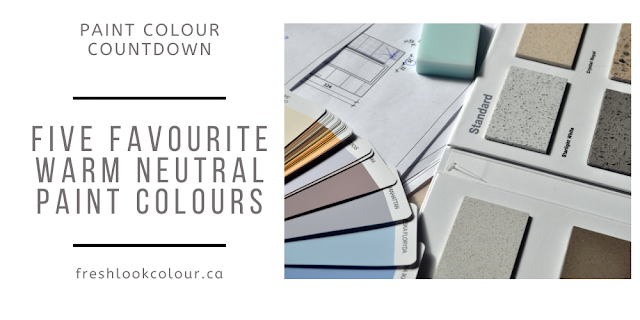
Hi Everyone
Thanks for checking out my blog today. I wanted to do things a little differently today when talking about how to choose a white paint color for your home. I could show you a bunch of pretty pictures (which I might do anyways 😉) but that won't help you know how to choose the right white paint color for your home. So what I wanted to do today is try and break things down a bit so it will give you an understanding of how to choose the right white (or any other color) for your home. There are three important things to consider when choosing a paint color for your home which are: undertones (paint and existing furnishes), lighting and temperature of colors. This is a very basic breakdown but will hopefully help you with choosing paint colors or maybe explain why you don't like something you've already painted.
Undertones
I often hear people referring to gray or brown undertones but that in fact isn't the case. There may be brown or gray in the paint color but the actual undertones are yellow, red, blue and green. There may be a combination of any of these colors ie: red+blue=purple.
When choosing a white paint color it's also important to consider the undertones in your existing furnishes. For example if you have a floor with a lot of red in it you wouldn't want to choose a white paint color with a green undertone. While it's important to know the undertone, especially when working with neutrals, please keep in mind that lighting can really affect the undertone that you see in a color - more about that later.
Temperature
When talking warm or cool colors most people will say that yellow, orange, and red are your warm colors and green, blue and purple are your cool colors but in fact you can have a warm and cool version of each color. Here is an example which will hopefully make more sense:
So hopefully you can see that although you would normally refer to yellow as a warm color you can see that there is a warm and cool version of what would normally be referred to as a warm color. I tell you this just to say 😏 it's important not to mix warm and cool paint colors or finishes. Just as a side note, it also looks odd in fashion when cool and warm versions of the same color are worn together. When I refer to warm paint colors or finishes it simply means there is some amount of brown tint in the color.
This is important when talking about white paint colors as you will often hear people refer to a warm white or a cool white.
Exterior Lighting
North facing = cool or blue light
East facing = slightly warm
West facing = warm or yellow light
South facing = warm or yellow light
Lighting and undertones play hand in hand. Example - you may have chosen a paint color with a yellow undertone in a north facing room and now you can see green in your paint color as yellow+blue=green.
I'm hoping none of this is discouraging you 😖from choosing a paint color but hopefully you can use this as a guide. Most importantly if you are trying to choose a paint color PLEASE do not use those small chips at the paint store but test your colors at home.
I personally find the best way to see how a paint color really looks is to compare it to another paint color. If you are having trouble determining the undertone of either your furnishes or paint color, try taking a picture and looking at that instead to determine undertones.
Now for the fun part - I'll start sharing some of my favourite Sherwin Williams white paint colors. Because there are so many beautiful white colors, and we are all very busy people 😀, I'm only going to share 4 of my favourite whites and why these are my favourites.
Pure White SW 7005
Now truth be told I have so many whites that I like but Pure White is one of my go to whites for interior trim (baseboards and casings). Pure White has an LRV (light reflective value) of 84 - a pure white would be 100 and a pure black would be zero. I like to stay away from anything creamy when choosing trim colors as that can become what I like to call a "bossy" trim where Pure White is a very neutral, crisp white and looks great with a lot of paint colors. It does have a very, very, very 😉 slight yellow undertone and is what I would consider a warm white. This next picture is where we used Pure White on the walls.
High Reflective White SW 7757
If you are looking for a white with virtually no undertone then High Reflective White is a great choice. I've often used this color on exteriors when tying in white windows with white trim color. As I mentioned earlier HRW has virtually no undertone but it would be considered a warmer white. It has an LRV of 93 so pretty much the highest LRV you can get when it comes to paint color. It is also a great color to use on trim and casings on the inside of your home as it's a crisp, clean white to pair white light or dark wall colors. It's also an option you may want to look at if you are considering painting your cabinets white.
Aesthetic White SW 7035
Aesthetic White is one of my new favourite white paint colors. The name is actually a bit misleading as there is quite a bit of "color" in Aesthetic White. I would describe this color as a very light gray with a tinge of beige in it, so it would be considered a warm color. It has an LRV of 73 and because it is a lighter color something like High Reflective White would be a great trim option. I've mentioned this before but when looking at paint colors ensure you are holding them vertical and not lying horizontal on a table or floor. This will make a big difference to how the color looks and gives you an entirely different perspective. We are in the process of developing our basement and I'm using Aesthetic White on the bathroom walls, once it's completed I will include a picture of that as well.
Panda White SW 6147
Similar to Aesthetic White, Panda White also has quite a bit of color in it. It is a warm white and falls more into the greige category as it has more beige than Aesthetic White. You would probably only notice that though if you actually compare the two side by side on a vertical surface. As I mentioned earlier, sometimes the best way to look at a color is to compare it to another color to truly see the nuances in it. Panda White has an LRV of 77 and a slight yellow undertone. I just can't find a great picture of this color so I'm going to exclude as I don't want to turn you off this beautiful white with a bad picture. 😬
Do you have a favourite or go to white that you use? I'd love to have you join my VIP Facebook group for all things color or if you are looking for an online color consultation please check out my website. For a limited time I am offering a 15% savings on online consultations, use the code Fresh15 to receive your discount. I look forward to hearing from you soon!


Such a helpful guide. white paint seems simple, but it’s surprisingly tricky with all the undertones and lighting effects! I love how the right shade can completely change the vibe of a room. As someone in the kitchen & hospitality niche, I really appreciate thoughtful design tips like this. I run a website focused on whipped cream chargers and dispensers, so Make sure to visit our Website: https://www.supreme-whip.com/
ReplyDeleteGreat post! I really enjoyed the insights you shared. Really informative post, also visit this website: https://miamimagic.com/
ReplyDelete