Hi Everyone
Thanks for checking out my blog today. Usually about this time of the year we'd be heading south with our trailer for a few months, but for obvious reasons 😔 this year will be different. Thankfully, so far, we've had a very mild winter but I'm sure that will change soon 😏, after all we do live in the prairies.
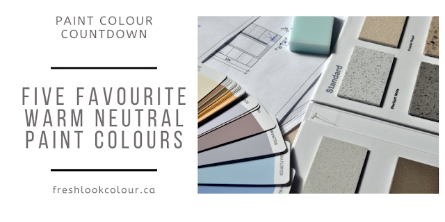
In a previous blog I shared the COTY's for 2021 and I briefly talked about the the Colormix Color Forecast for 2021 by Sherwin Williams. Over the next four blogs I wanted to dig deeper into the Colormix palettes and I'll share with you some of my favourite paint colors from each of those palettes. There are 4 color palettes with a total of 40 hues. While I don't subscribe to the notion that your paint colors need to be on trend, I still thought it would be fun to look at where color is going in the next little while - you'll start to notice these colors showing up in home décor and even fashion. The first palette I wanted to share with you is Sanctuary - the source for all this information and photos is Sherwin Williams unless I've stated otherwise.
Sanctuary
"Nature’s ability to cultivate wellness and calm is more welcome than ever. The nurturing hues of this palette, including warm neutrals and natural tones, forge the connection between the modern built environment and the living world."
Influences for this Palette
Wellness + Biophilia
Nesting
Warm Minimalism
Scandinavian Design
The ten paint colors that make up this palette are:
There are actually quite a few colors from this palette this I use on a regular basis but today I wanted to showcase Oakmoss and Modern Gray. I am also a big fan of Urbane Bronze but I've blogged about that color
here so I'm going to restrain 😶 myself today!
Oakmoss SW 6180
Now to be honest with you I have never used Oakmoss, but I have used it's lighter cousins (on same paint strip) Liveable Green SW 6176 and Clary Sage SW 6178. Oakmoss is a dark green with an LRV of 13. If you aren't familiar with LRV it simply refers to how much light that paint color reflects back into the room, a pure black is zero and a pure white is 100. Oakmoss also has a strong yellow undertone, which puts it squarely in the sage or verdant green category. I personally love sage green so I'm pretty happy about this color being featured in the Sanctuary Color Palette. As I'm writing this blog I am wearing a brand new, dark sage green hoodie so this color has entered fashion as well (not that I pretend I'm on the cutting edge of fashion 😁).
Oakmoss a great color to feature as I'm noticing a lot of green kitchen cabinets lately. This would also be a great choice for a kitchen island if you want to tippy toe into this world of greens. This next picture isn't Oakmoss but very similar.
Oakmoss would also be a great choice for exterior or interior doors. I always enjoy looking at the Ikea catalogue as it also gives you a pretty good idea where we are going with color.
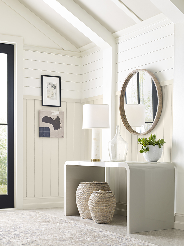
Modern Gray SW 7632
I would categorize Modern Gray as a gray with a very large dose of beige in it - depending on your lighting and finishes it might go either way. Modern Gray has quite a strong red undertone but don't let that scare you off as it gives warmth to this color. The LRV of Modern Gray is 62 so it's a great option for an all over color. I've had several clients use this color in their homes and it's a great way to update your paint colors if still working with beige finishes. I would not recommend using this color if your finishes have a strong yellow undertone - it will only bring out the red in Modern Gray which would not be a great look 😕! There are also some homes with what I call a "bossy trim" color meaning it's very creamy or even in the tan family and again I would not recommend Modern Gray. If you are looking for a trim color to go with Modern Gray either Pure White SW 7005 or High Reflective White SW 7757 would be great choices.


So what do you think of the Sanctuary Palette by Sherwin Williams? Do you think it's relevant in today's color world?
I'd love to have you join my new Facebook VIP group where we discuss all things color related. It will give you the opportunity to ask questions or show off any recently completed projects. If you need help choosing paint colors for your home or office I'd love to help make that process easier with an
online consultation.
Have a Colorful Day!


Comments
Post a Comment